About Me

My photo
Staten Island, New York, United States

Sunday, March 17, 2013

The Collaborative Process: Back from Argentina

Bruce Cohn's photos are the source materials for our collaborative art exhibit Abrazo Argentina: Embracing a Culture that we are having at the Tottenville Library in November 2013.* He attended a photography workshop in Argentina in February. Bruce took over 1,000 photographs, both digital and traditional black and white, taken with his Leica. He was in Argentina during Carnaval, and although much more subdued than Carnaval in Brazil, the resulting photos do have that festive aspect to them.

I visited Buenos Aires about 10 years ago, on a tango pilgrimage to attend a tango festival there. As in any city, there are many must-see sites that any first-time visitor to the city will visit, so I was familiar with many of the places Bruce visited. Daily e-mail contact about his activities refreshed my memories and I could share in his enthusiasm for the vitality of the city. 

Buenos Aires is a very photogenic city. Streetscapes vary from Parisianlike boulevards to colorful cobblestoned barrios. There's the muddy Río de la Plata and the port, life sources for the city. Bruce also ventured out to San Antonio de Areco, outside the city, where he got a taste of a less urban Argentina, complete with gauchos.

Our project focuses on the rich culture of Argentina. As Bruce and I poured over all his pictures, several themes emerged that capture the essence of our impressions of its unique culture. We are in the process of creating 8 large scale canvases that will hang in the main room of the library. Hopefully we will have time to create 4 more even larger ones, but frankly, I panic when I think of all that work! So, we have about 8 themes (subject to change); Tango, Cafe Culture, Protest, Death, Streetscapes, Carnaval, Gauchos, the River & Port (from which the nickname for residents, Porteños, stems).  Work on these pieces has begun. More on that in another blogpost. 


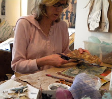
in my studio; prints, xeroxes, source photos and paper lithographs
I have source photos that Bruce printed up for me spread out on a table in my studio. I have ideas about a color palette (bright!) and some patterns suggested by the streetscapes, such as grillwork, cobblestones, and store signs (fileteado). I'll use some of these photos to make drawings and others I'll use to make xeroxes. I'll blow the xeroxes up really big and make paper lithographs from them. Bruce has a different agenda for other photos.

As I had hoped, Bruce came back with surprises. He is drawn to people and his personableness puts them at ease. He captured a breadth of faces; young, old, outlandish, worn-out, but all tell a story. Because of their particularity and dignity, I think those photos stand by themselves well, in their own places of honor. 

I was delighted by a series of photos Bruce took of reflections. They are instant collages (!) created by capturing the juxtapositions that happen in a moment in time. They couldn't be more perfect for this exhibit, since I'm making collages. I'll be encouraging Bruce to print them large. Other photos, especially one he took in the Recoleta Cemetary, are just achingly beautiful and I keep saying "Big!" "Print it really BIG!" After all, we have a lot of space to work with.

Back to work in the studio for me, with lots of inspiration and plenty of work to do.
*This project is made possible (in part) by an Encore Grant from the Council on the Arts & Humanities for Staten Island, with public funding from the New York State Council on the Arts.

Saturday, February 9, 2013

The Collaborative Process: Inspired by the Space

Here we are, leaving the stage, award envelope in hand.
Bruce and I have been visiting the Tottenville Library to scope out the space for our collaborative exhibition that we are having there in November 2013. Our project is made possible (in part) by an Encore Grant from the Council on the Arts & Humanities for Staten Island, with public funding from the New York State Council on the Arts. We had the official  COAHSI awards ceremony on January 27, (photo left) where we received the grant. 

Now the work begins. We have our concept, to honor the culture of Argentina. It's Bruce's job to take the pictures we will use to base the project on. I am beginning to prepare the pieces themselves.

One of our first tasks is to figure out how many pieces we want to create and what sizes will work best for the space. My first impression when I walked through the door of the library was of sheer awe. The room soars up to a gorgeous heavy timber ceiling. Grand arched windows grace the walls. You can kind of get an idea from the picture below. The library opened in 1904 and it looks like this picture was taken around that time. It has not changed substantially in appearance since this photo was taken.

vintage photo of main room of Tottenville Library
Courtney Castellane, the library manager, has been very generous and gracious in offering us to hang art throughout the library. As it turns out, she is a former student of Bruce's and is eager to be the community facilitator for our project. If it weren't for her, we wouldn't have an audience for the art.

yummy - look at those empty walls!
This space deserves grand art and I think we owe it to the space to create that art. That also makes for a more ambitious project than we had already envisioned. It's a good thing there are two of us and that we have the better part of a year in order to get it done!

We had originally envisioned just working on paper and exhibiting in the communal meeting area in the basement. Certainly there is plenty of exhibition opportunity there and we do intend to exhibit in this space, too. The advantage of this space is that the public will get a chance to get up close to the artwork and examine the details. Often in my own work, the layers that make up the surface are very intricate. And, of course, Bruce's photographs are generally meant to be viewed at close range.
community room 

But, what about that upstairs space? We could still work on paper, but it would be prohibitive to frame work of the scale that makes sense for the space. I want to work on canvas.

I did a little research online and discovered that there is a way I can transfer the paper lithographs I make to canvas. Some tests proved it. I will be able to make prints directly from scaled-up versions of Bruce's photographs and transfer them to the canvas in this way.

Some 90 yards of canvas are now waiting for me to take the next step.  My next blogpost will explore how that goes.

Tuesday, January 1, 2013

The Collaborative Art Making Process: Starting Out


At some point in 2012, Bruce Cohn and I decided to embark on a collaborative art project, combining his photography with my collages. This was prompted by his signing up for a photography workshop in Argentina in February, 2013. The workshop will use Buenos Aires as a base and the group will photograph three nights of Carnaval, a tango club, and make day trips to several colonial towns outside the city.

Bruce is an accomplished photographer, but has been away from it for awhile and wants to use the workshop to get back into the swing again. It was only a short hop for me to suggest a collaboration, since my collages are all about the Argentine tango and Buenos Aires. I've been making these collages for a few years and could use a little creative infusion. Bruce and I have a playful, respectful, and energy-filled relationship. We never tire talking about art.   It seemed like this was all good stuff to bring to a collaborative project in the studio. Who knows where it could lead?

Our first collaborative artistic adventure, Bruce and I
showing our work together at the Staten Island Museum's
annual Fence Show, Sept. 2012
To formalize the collaboration and motivate us to actually carry it out, we decided to apply for a grant* from COAHSI, the Council on Arts and Humanities for Staten Island. Bruce lives on the South Shore and one of the things about Staten Island is that there is a huge Mason-Dixon type divide between the South Shore and the North Shore. Since I'm a well-established (North Shore) art citizen here, I know that most art projects and artists are clustered on the North Shore. COAHSI is always looking for projects that take place on the South Shore. Bruce has all kinds of connections and scored us a venue for our grant project at the Tottenville Library on the South Shore. We just found out that we won the grant (yay!). Full steam ahead for a November, 2013 exhibit at the library!

Portrait collage ca. 1860,
ambrotypes with applied color
Bruce and I have been thinking about innovative ways we might combine our two art forms. We have been looking at alternative photography techniques. Bruce makes pinhole photos and I participated in a pinhole photography workshop he volunteered for at the Alice Austen House (not so coincidentally the financial conduit for our grant). During Hurricane Sandy we made photograms until the lights went out. For me it's been very helpful to go back to the very basics of photography.

We recently visited the exhibit Faking It: Manipulated Photography Before Photoshop at the Metropolitan Museum of Art. There we saw this tiny ambrotype (photograph printed on glass). You can't really tell from this photo that it's painted on glass. That's why we go to museums to see art. A lightbulb went off in my head - you can print photos on glass????  Sounds like fun! Bruce knew about liquid emulsion, which enables one to print photos on all sorts of surfaces. 

We got ourselves some liquid emulsion and gathered together some materials; some of the papers I use in my collages, plywood treated with various finishes, and some ceramic tiles left over from a bathroom project. As with most experiments, we had successes, failures, and happy accidents. Here are some examples. 
Photograph ©1979 Bruce Cohn,
printed on plywood treated with
matte acrylic medium

Photograph ©1979 Bruce Cohn,
printed on ceramic tile


We love the warmth and pattern of the wood in the sample on the left. The image on the ceramic tile lifted up in the water wash, but when it dried it settled back onto the surface of the tile and made those wonderful black cracks. We now know how to make it adhere, but would like to try recreating this happy accident.

It's just a start. We can't wait until Bruce comes back from Argentina in February with images so that we can get to it in the darkroom and studio. In the meantime we will continue our experiments and plan out our project timeline. We're hoping this project takes our art to some place completely new. Stay tuned!
*This project is made possible (in part) by an Encore Grant from the Council on the Arts & Humanities for Staten Island, with public funding from the New York State Council on the Arts.

Wednesday, May 30, 2012

June in Staten Island: LOTS of ART!


June is a busy month for the arts on Staten Island. I'm involved with some of them and want to make you aware of some of the coolest, most unique art events in the NYC area.


June 9th and 10th: 12-7:30PM at venues close to the SI Ferry terminal (see map above)

June 8th  7:00 PM:   opening and fundraiser at 60 Bay St.  
$20 per person includes:   
Preview of art exhibit, 
Readings curated by Marian Fontana, 
Music by Allergic to Bees, Food & Wine
I will be showing VERY affordable small collages at 60 Bay St and a large piece in the group show at 70 Bay St.


AND

Lumen

Saturday June 23rd, 6pm to midnight (best after dark)


An absolute 

MUST SEE
totally hip art event! It is an international site-specific video art and projection festival, held on the bustling Staten Island industrial waterfront.  This year it will be held at the Atlantic Salt Company. It's a great evening of visual treats you will see nowhere else! (And, to enhance it, I believe they will be serving beer this year.)


AND


Juried Art Exhibit 2012 
Staten Island Museum 75 Stuyvesant Place (a block from the ferry)

June 28 - September 23, 2012

Opening reception Thursday June 28, 6:00 - 8:00 pm

I got one piece accepted in this show. There is a very talented line-up of artists who are included, many of whom have not received the attention they deserve. Come and be one of the first to discover this hidden talent.


AND


Titanic: A Centenial Exhibition of Contemporary Art

Noble Maritime Collection, Snug Harbor

I have one piece in this exhibit and small collages for sale in the gift shop.

The exhibit remains up till the end of the year. 


Inspired by the whole Titanic centennial, I created a limited series of one-of-a-kind small collages. I will be selling them at Art by the Ferry. Preview them at my Etsy shop.
Yours from the studio,
Denise Mumm

Sunday, March 11, 2012

Art Feast: Visiting the Armory Show, NYC 2012

I attended the 2012 Armory Show at piers 92 and 94 on Friday night. I was not interested in seeing contemporary art, although I know this is an opportunity to see art trends from outside NYC. I was particularly looking forward to seeing the work by Morandi that the NY Times had talked about and the other gems by established artists that galleries bring to these shows. I love the intimate exposure to the art, conversing with gallery representatives, and just wallowing in art for a few hours. On this occasion, with a few notable exceptions, I found myself drawn to prints and sculptures.

Entering the show at the Marlborough Gallery booth we were greeted by two clever sculptures referencing other objects. One, at first glance, is a bookcase filled with incredibly worn old books. But, no, stepping closer, it becomes apparent that this is a stack of roughly hewn blocks of wood, definitely wood yet with the slump, tilt, color and scale of old books.

The other sculpture (at left) was made of smooth marble, immediately recognizable as a reference to the central figure from Velazquez' Las Meninas in its color, shape and texture.

Onward, in search of those Morandi paintings. . .  They were at the Galleria d'Arte Maggiore booth.  

Now, I missed the Giorgio Morandi retrospective at the Metropolitan Museum of Art in 2008, much to my regret. His paintings are not often on view and especially not in quantity. I have wanted to experience them in person ever since my first painting teacher at the University of Iowa would use Morandi's paintings as examples in his critiques. One of the challenges of being in art school in Iowa was that our access to actual paintings was limited, mostly through slides and books, so I'm not sure I ever understood what my professor was trying to tell me. (Imagine all my "aha" moments visiting European art museums after graduate school. But that's another blogpost. . .)

Morandi painting
So, here I was, finally nose to nose with Morandi's oil paintings. The first thing that struck me, aside from the quiet tones and static composition, is the way the brushstrokes describe the forms. The artist's hand is present, building the surface of the painting. The warm versus cool tones of beige, push and pull the forms in the picture plane. The atmosphere around the objects has a palpable presence, almost as if the whole painting was formed in clay. This is not the world of atmosphere and shadows that we live in, but rather the painting obeys its own laws of physics.

Morandi etching

Shown in conjunction with the paintings were some etchings, with the same kind of vessel forms as subject matter and of the same scale as the paintings. Of course, this being an etching, the marks build the surface of the print. This is a claustrophobic environment. But, there's something else going on here, too. Forms appear to have been cut and applied to the surface, rather than emerging from the muck of the background as in the paintings. Although dimensionality is represented with highlights and crosshatched shading, those marks also look like decoration on the surfaces of flat forms. Light is malleable and somewhat arbitrary.

There were also some delicate watercolors by Morandi, obviously done on site, which explored outlines of forms and stark contrasts of light and dark. This booth offered a richly satisfying taste of my painting professor's hero. Maybe I am finally learning the lessons he was trying to teach
me.


More favorites at the show:

Henry Moore, Studies 1942


Jacob Lawrence at DC Moore

Scrumptious prints by Marylyn Dintenfass at Babcock Galleries


I continue to be astonished that tempera can be such a beautiful medium in Jacob Lawrence's hands.
Helen Frankenthaler, Ukiyo-e style woodcuts at Pace Prints


Would somebody please tell me how these woodcuts are made? This photo does not begin to show the layers and subtleties in these prints. They are so fresh, lively and painterly.


A quick walk through the Contemporary section of the show was interrupted by a visit to this sculpture. Drawn to it by the noise of many ball bearings moving across a slowly slanting steel plate, this sculpture is the kind of thing you could sit and watch for hours, like a fire. It reconfigures itself according to some laws of physics which elude me. It reminded me of those Morandi paintings again with their internal laws of physics.  And the patterns that the ball bearings created were like those brushstrokes.
Wave of Matter, Tommi Grönlund - Petteri Nisunen, Galerie Anhava


After nearly two and a half hours of intense looking and a head full of images that were the results of lifelong artistic explorations, not to mention walking on a concrete floor, I was worn out. I could relate to this sign (at left) near the exit.

All in all, a satisfying visit to this year's Armory Show. I felt as though I had feasted on some very rich food indeed.

Saturday, February 18, 2012

Art of the Heirloom (seeds, that is) Exhibit at the Horticultural Society of New York

Art of the Heirloom opening, seeds for sale at right
I attended a lively art opening last night at the Horticultural Society of New York. The exhibit is called Art of the Heirloom and is presented by the Hudson Valley Seed Library. The exhibit is comprised of original art that was commissioned for a collection of seed packets


I first ran across this company at the New Amsterdam Market (at the former Fulton Fish Market) where I met Ken Greene, the Seed Library's founder. He got the idea for the Seed Library when he was working at a regular library and thought to himself "why not try a seed library based on the same principles as a library that lends books?" Members would save seeds from their own crop each year and contribute them back. The idea has grown exponentially since then, but seed saving by backyard gardeners is still a big part of it. I like to use these seeds in my own garden because I know that they come from the region where I live and thrive here.

Ed's Kohlrabi, Sheryl's Rainbow Chard
The other wonderful thing that the Hudson Valley Seed Library does is promote regional artists through their seed pack commissions. I have two artist friends, also gardeners, who have done commissions. Last year Sheryl Humphrey did a painting for Rainbow Chard. This year her husband, Ed Coppola, did a collage for Purple Vienna Kohlrabi. Ed's collage was in the exhibit and that's what brought me to the opening. Sheryl was a natural choice since she paints vivid iconographic paintings, often of women's faces surrounded by lush vegetation.

Ed Coppola next to his collage
Ed's collages have a tongue-in-cheek science fiction aspect to them, which is very well suited to the otherworldly "sputniklike" look of a kohlrabi. All of us artist/gardeners on Staten Island have vowed to make the kohlrabi the next big vegetable and will be growing them in our own gardens this year, using these seeds.

The art for the seed packs were not all two-dimensional. Some of my favorites were sculptural. There was a very  elegant ceramic wall piece, Kale Cubes, done by Gregg Moore.

 I was also delighted by some felt radishes with a lot of personality that were made by  Melissa Mandel. During the artist talks Ken Greene held one of the radishes up by its leaves, reminding me of holding up a rabbit by its ears. 
 This exhibit will be traveling. And while the art itself belongs to  the Hudson Valley Seed Library, there are fine art prints of the artwork available for sale. I got very inspired and will be applying to do a seed pack commission myself for next season.
snacks with a garden-y presentation
Although the art was great, I have to say a word about the beverages being served, as well. True to the spirit of the Hudson Valley Seed Library, the drinks were also regional. The beer was from the Ommegang Brewery, a Belgian style brewery in Cooperstown, NY. And there was also whiskey from Tuthilltown Spirits Distillery  in the Hudson Valley. Now, I already love the Ommegang beers, but I'm a new fan of the Tuthilltown whiskey - very smooth, yummy and warming!  


Thursday, February 9, 2012

Hand-painted Wall Advertisements Still Being Done in NYC

So, I'm working in Soho and one day I went outside for lunch and looked up to find two guys actually painting a 7 storey advertisement on a wall. First of all, when one doesn't have one's head bending over an iphone at all times, one can witness all sorts of unexpected phenomena like this. Secondly, it's so nice to know artists are still getting hired to paint for a living. The first day it was hard to say what this painting was going to turn into.
Day One

The next day I checked on the painters' progress. They had done a lot of work in one day. 
Day Two


Day Three
On the following day it was clear that this was developing into a trompe l'oeil painting of two giant holes punched through the building and leading out to a beach. 


Finished Painting
The next day the scaffolding was cleared away. The artists were gone. The whole side of the building was now an advertisement for Jamaica, showing people at the bottom escaping out through the building onto a beach. The painting is visible from quite a distance. Well, visible to foot traffic. It's a one-way street, with traffic facing away from the building. But, all in all, not bad exposure for a couple of artists, whoever they are.